If you are a member of the Elementor family, then there is a very good news for you.
You can now add additional breakpoints to make your website more and perfect responsive across all devices.
YES, You heard it right. Elementor now gives you the option to add new breakpoints, which means that you can now handle elements on your page with more media queries.
Let us understand what are the advantages of having more breakpoints in responsive.
Table of Contents
What Is Breakpoints?
The “point” at which a website’s information and design will change in a specific way to offer the optimal user experience is known as a breakpoint in a responsive design. For instance, when visiting the W3Mind’s website on a standard desktop display, the viewer can see the entire navigation menu in the sidebar. But when we see the W3Mind’s website on a mobile device navigation menu will be displayed on the top left of the screen as a menu.
So basically CSS breakpoints are very useful for creating a perfect responsive web design, as it offers an awesome user experience on different screen sizes.
If we go deeper, Breakpoints developer/designer define in CSS. These are basically pixel values and when the responsive website reaches that pixel value, a transformation appears in it.
Why Additional Breakpoints?
As you understood above, having breakpoints is very good for a responsive site. Which gives you more freedom to manage your site’s responsiveness well. So if you have more breakpoints then you can improve the responsiveness of the page better.
How To Add Additional Breakpoints In Elementor
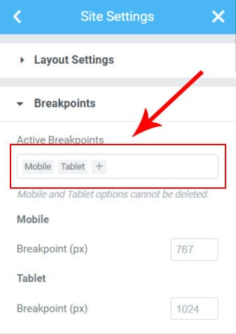
Let’s see how we can add additional breakpoints in Elementor.
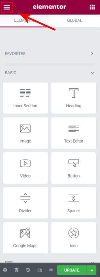
So for this you will need to edit any page in Elementor and click the hamburger menu on top left corner.
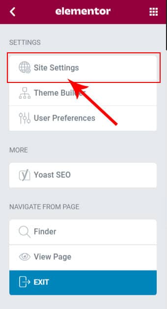
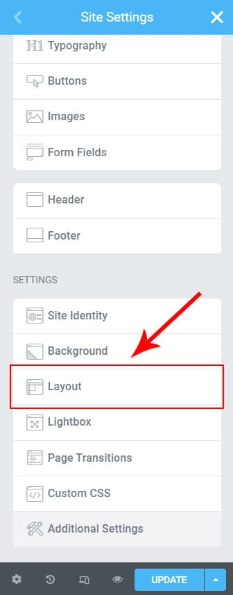
After doing this you can go through the screenshots given below.
Watch this quick video

