Welcome back to our blog W3mind.
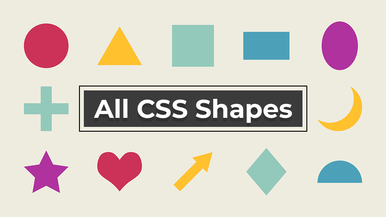
Today we will know how many types of shapes you can make with the help of CSS. You can use these CSS shapes at many places on your website.
For example, if you want to create a circle image on your website, so instead of uploading an image you can create it as a shape with CSS property. The advantage of doing this will be that the load time of your page will be improved. Now you must know why we should use CSS shapes.
Lets learn more about CSS and CSS shapes.
Table of Contents
What is CSS?
Cascading Style Sheets, commonly known as CSS, have evolved significantly over the years. In simple words, CSS is the magic that makes websites pretty. It’s the tool that decides how big the headings should be, what color the buttons should have, and how far apart the paragraphs should be spaced. It’s all about making web pages look great and easy to read. So, when you see a beautifully designed website, you’re looking at the work of CSS.
The Evolution of CSS for Shape Creation
In the early days of web design, creating shapes beyond simple rectangles and circles often required images or complex HTML structures. However, with the advent of CSS3, designers gained the ability to craft shapes using code alone, opening up a world of possibilities for creative and lightweight web design.
Basic Geometric Shapes
Let’s start with some fundamental geometric shapes and their CSS representations:
1. Circle Shape
					.circle {
  width: 100px;
  height: 100px;
  background-color: #e00000;
  border-radius: 50%;
}
2. Square Shape
					.square {
  width: 100px;
  height: 100px;
  background-color: #e00000;
}
3. Triangle Shape
					.triangle {
  width: 0;
  height: 0;
  border-left: 50px solid transparent;
  border-right: 50px solid transparent;
  border-bottom: 100px solid #e00000;
}
4. Oval Shape
					.oval {
  height: 100px;
  width: 200px;
  background-color: #e00000;
  border-radius: 50%;
}
5. Trapezoid Shape
					.trapezoid {
	border-bottom: 100px solid #e00000;
	border-left: 25px solid transparent;
	border-right: 25px solid transparent;
	height: 0;
	width: 200px;
}
6. Parallelogram Shape
					.parallelogram {
	width: 200px;
	height: 100px;
	transform: skew(20deg);
	background: #e00000;
}
7. Triangle Up Shape
					.triangle-up {
	width: 0;
	height: 0;
	border-left: 50px solid transparent;
	border-right: 50px solid transparent;
	border-bottom: 100px solid #e00000;
}
8. Triangle Down Shape
					.triangle-down {
	width: 0;
	height: 0;
	border-left: 50px solid transparent;
	border-right: 50px solid transparent;
	border-top: 100px solid #555;
}
9. Triangle Left Shape
					.triangle-left {
	width: 0;
	height: 0;
	border-top: 50px solid transparent;
	border-right: 100px solid #555;
	border-bottom: 50px solid transparent;
}
10. Triangle Right Shape
					.triangle-right {
	width: 0;
	height: 0;
	border-top: 50px solid transparent;
	border-left: 100px solid #555;
	border-bottom: 50px solid transparent;
}
Complex Shapes and Designs
CSS3’s versatility extends beyond basic shapes, allowing designers to create intricate patterns and designs. Here are a few examples:
11. Triangle Shape
					.heart {
    width: 100px;
    height: 90px;
}
.heart::before,
.heart::after {
    position: absolute;
    content: "";
    left: 50px;
    top: 0;
    width: 50px;
    height: 80px;
    background: #e00000;
    border-radius: 50px 50px 0 0;
    transform: rotate(-45deg);
    transform-origin: 0 100%;
}
.heart::after {
    left: 0;
    transform: rotate(45deg);
    transform-origin: 100% 100%;
}
12. Star Shape
					.star {
  width: 0;
  height: 0;
  border-left: 50px solid transparent;
  border-right: 50px solid transparent;
  border-bottom: 100px solid #e00000;
  position: relative;
}

.star::before {
  content: "";
  width: 0;
  height: 0;
  border-left: 50px solid transparent;
  border-right: 50px solid transparent;
  border-top: 100px solid #e00000;
  position: absolute;
  top: 35px;
  left: -50px;
}
13. Pentagon Shape
					.pentagon {
      position: relative;
      width: 54px;
      box-sizing: content-box;
      border-width: 50px 18px 0;
      border-style: solid;
      border-color: #e00000 transparent;
    }
.pentagon:before {
      content: "";
      position: absolute;
      height: 0;
      width: 0;
      top: -84px;
      left: -18px;
      border-width: 0 45px 35px;
      border-style: solid;
      border-color: transparent transparent #e00000;
    }
14. Hexagon Shape
					.hexagon {
  width: 100px;
  height: 58.735px;
  background: #e00000;
  position: relative;
}
.hexagon::before {
  content: "";
  position: absolute;
  top: -28.7px;
  left: 0;
  width: 0;
  height: 0;
  border-left: 50px solid transparent;
  border-right: 50px solid transparent;
  border-bottom: 28.8675px solid #e00000;
}
.hexagon::after {
  content: "";
  position: absolute;
  bottom: -28.7px;
  left: 0;
  width: 0;
  height: 0;
  border-left: 50px solid transparent;
  border-right: 50px solid transparent;
  border-top: 28.8675px solid #e00000;
}
Quick Note: The examples provided in this article are just a glimpse of the possibilities CSS3 offers for shaping the visual elements of your web pages. Explore, experiment, and elevate your web design skills with CSS3's shape creation capabilities.